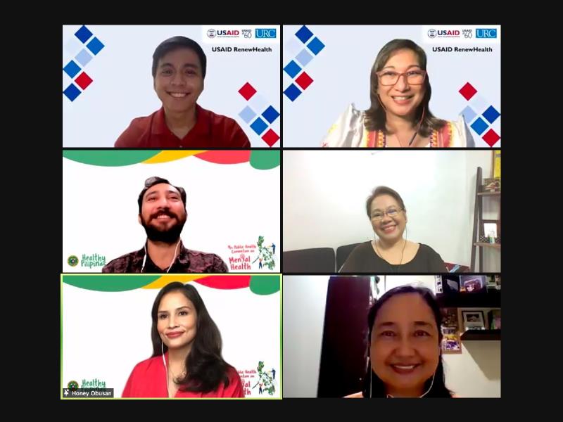
The Philippine WHO Special Initiative for Mental Health conducted in the early part of 2020 showed that at least 3.6 million Filipinos suffer from one kind of mental, neurological, and substance use disorder. As part of the National Mental Health Awareness Week celebration, the Department of Health in collaboration with USAID RenewHealth launched “Lusog-Isip”, the first ever mobile app for self-care and mental health culturally-adapted for Filipinos.
During the online webinar, speakers presented preliminary results of the app’s pilot testing. Present during the launch were Mr. Patrick Angeles, Department of Health Program Coordinator, USAID RenewHealth; Dr. Ma. Regina Hechanova-Alampay, Chief of Party, USAID RenewHealth; Ms. Frances Prescilla Cuevas, Chief, Mental Health Division, Department of Health; Mr. Amadeus Pagente, Supervising Program Health Officer, Department of Health; Ms. Honey Obusan, event host and Dr. Yolanda Oliveros, Director, National Center for Disease Prevention and Control, Department of Health (DOH).
Lusog-Isip mobile app features screening and self-care tools, intervention programs and referral networks to help users navigate and manage their emotional and mental well-being. Lusog-Isip can be downloaded on AppStore and will soon be available on PlayStore.
TECHNOLOGY
TECHNOLOGY
TECHNOLOGY
ADVT.
.inline_ffff input { width: 70%!important; }
.bypro {
float: right;
width: 71%;
text-align: center;
margin-top: -12px;
margin-right: 15px;
clear: both;
color: #5C5C5C;
font-size: 8px!important;
line-height: 9px!important;
}
.lfform-inquirer-horizontal h2 {
font-weight: bold !important;
font-family: mallory !important;
}
@media only screen and (min-width: 360px) and (max-width: 767px) {
.lfform-inquirer-horizontal #myForm3 {
width: 100%;
display: flex;
flex-wrap: wrap;
justify-content: center;
}
.lfform-inquirer img {
width: 100% !important;
margin: 0 !important;
}
.bypro {
margin-top: 10px;
}
.lfform-inquirer-horizontal input[type=”email”] {
width: 100% !important;
}
.lfform-inquirer-horizontal input[type=”submit”], .lfform-inquirer-horizontal input[type=”button”] {
width: 100% !important;
}
}
.formv4 {
width: 100%!important;
max-width: 100%;
margin: 15px 0;
}
.formv4 input[type=”email”] {
font-weight: bold;
float: left;
-webkit-appearance: none;
margin: 0!important;
width: 70% !important;
}
.formv4 input[type=”submit”] {
font-weight: bold;
width: 28% !important;
padding: 3%;
float: left;
-webkit-appearance: none;
}
.formv4 #myForm3 {
width: 100%;
display: flex;
flex-wrap: wrap;
justify-content: space-between;
}
.formv4 .bypro {
width:100%;
font-family: ‘noto serif’;
float: unset;
clear: both;
color: #333333;
font-size: 11px!important;
line-height: 1 !important;
margin: 10px 3px;
text-align:left;
}
.formv4 a, .formv4 a:visited, .formv4 a:hover {
color: #0b72b5 !important;
text-decoration: none; !important;
}
.formv4 h2 {
font-weight: bold !important;
text-align: left;
font-family: mallory !important;
color: #333333 !important;
margin:5px 0 !important;
padding: 0 !important;
}
.formv4 p {
width: 100%;
text-align: left;
color: #5A5A5A !important;
font-family: ‘noto serif’ !important;
font-size: 14px !important;
margin: 0 !important;
line-height: 1.6em !important;
margin-bottom: 15px !important;
padding: 0 !important;
}
@media only screen and (min-width: 360px) and (max-width: 767px) {
.formv4 h2 {
font-size: 16px !important;
}
.formv4 .bypro {
font-size: 12px!important;
margin: 5px 5px;
}
.formv4 input[type=”email”] {
width: 100% !important;
}
.formv4 input[type=”submit”] {
width: 100% !important;
margin: 10px 0;
}
.formv4 {
width: 95%!important;
max-width: 95%;
margin: 20px auto;
}
}
#inqplus-article2 {
width: 100%;
height: 250px;
margin: 20px auto;
background-color: #a5b8c5;
display: flex;
flex-wrap: wrap;
justify-content: space-between;
align-items: flex-start;
}
#inqplus-cta-wrap {
width: 50%;
height: 250px;
background-image: url(/single2017/images/inqplus-sub/inqplus-cta-bg1.png);
background-repeat: no-repeat;
background-size: cover;
}
#inqplus-cta2 {
width: 89%;
height: auto;
margin: 35px auto 0;
}
#inqplus-cta2 img {
width: 100%;
}
#newsletter-cta-wrap {
width: 50%;
height: 250px;
background-image: url(/single2017/images/inqplus-sub/newsletter-bg1.png);
position: relative;
background-repeat: no-repeat;
background-size: cover;
}
#newsletter-cta2 {
width: 95%;
position: absolute;
bottom: -4px;
z-index: 1;
}
#newsletter-cta2 img {
width: 100%;
}
#inqplus-nl-sub2 {
width: 65%!important;
display: flex;
font-size: 0;
box-sizing: border-box;
z-index: 2;
position: absolute;
bottom: 10px;
right: 10px;
}
#inqplus-nl-sub2 form {
width: 100%!important;
}
.sub-input2 {
width: 70%!important;
height: 25px!important;
border: 0!important;
padding: 5px 0 5px 10px!important;
margin: 0!important;
box-sizing: border-box!important;
border-radius:0;
-webkit-appearance:none;
}
.sub-btn2 {
width: 30%!important;
height: 25px!important;
border: 0!important;
padding: 0!important;
margin: 0!important;
background-color: #004a87!important;
color: #f5f5f5!important;
text-transform: uppercase!important;
border-radius:0;
-webkit-appearance:none;
}
/* 414px */
@media only screen and (min-width: 414px) and (max-width: 599px){
#inqplus-article2 {
width: 98%;
height: auto;
}
#inqplus-cta-wrap {
width: 100%;
height: auto;
}
#newsletter-cta-wrap {
width: 100%;
}
#newsletter-cta2 img {
width: 90%;
}
}
/* 320px */
@media only screen and (min-width: 320px) and (max-width: 413px){
#inqplus-article2 {
width: 98%;
height: auto;
}
#inqplus-cta-wrap {
width: 100%;
}
#newsletter-cta-wrap {
width: 100%;
}
}